Responsive Design Template
Responsive web design is an approach to design that make web pages render well on all screen sizes and resolutions while ensuring good usability. On this site I accomplish this using CSS media queries. Media queries allow us to run a series of tests (e.g. whether the user’s screen is greater than a certain width, or a certain resolution) and apply CSS selectively to style the page appropriately for the user’s needs.
Take a moment to view this page at different screen widths using responsive design mode. In most browsers you should be able to open this using CTRL + SHIFT + M. Try adjusting the width of the screen.
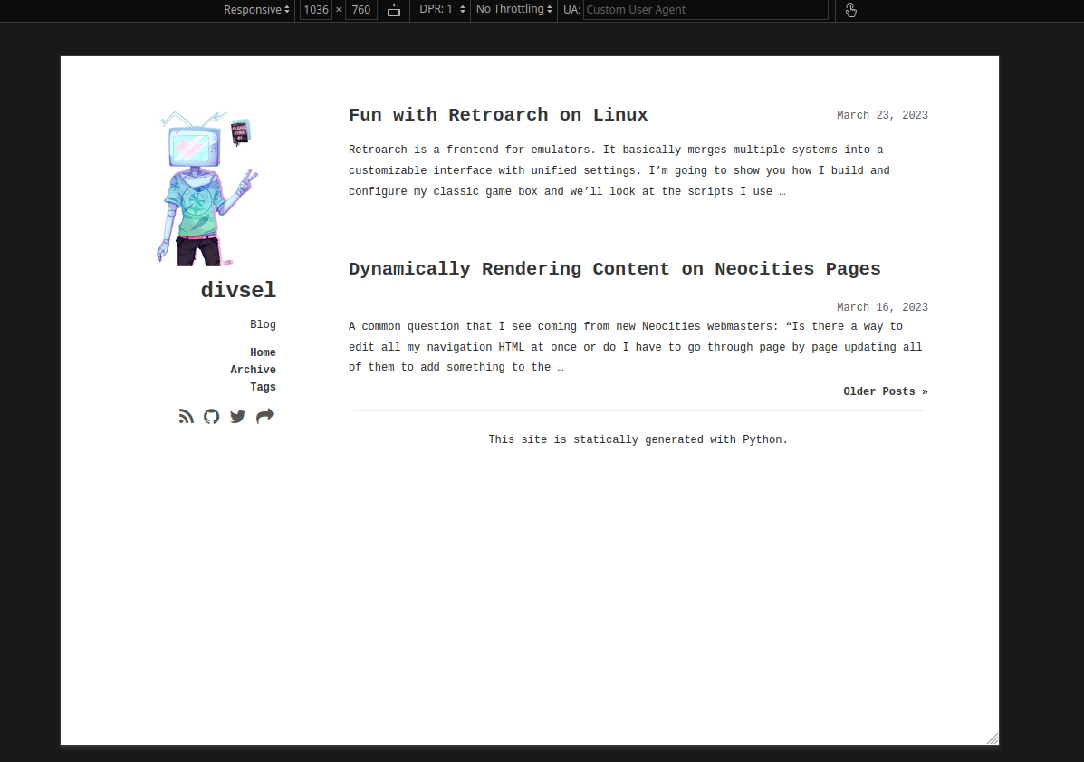
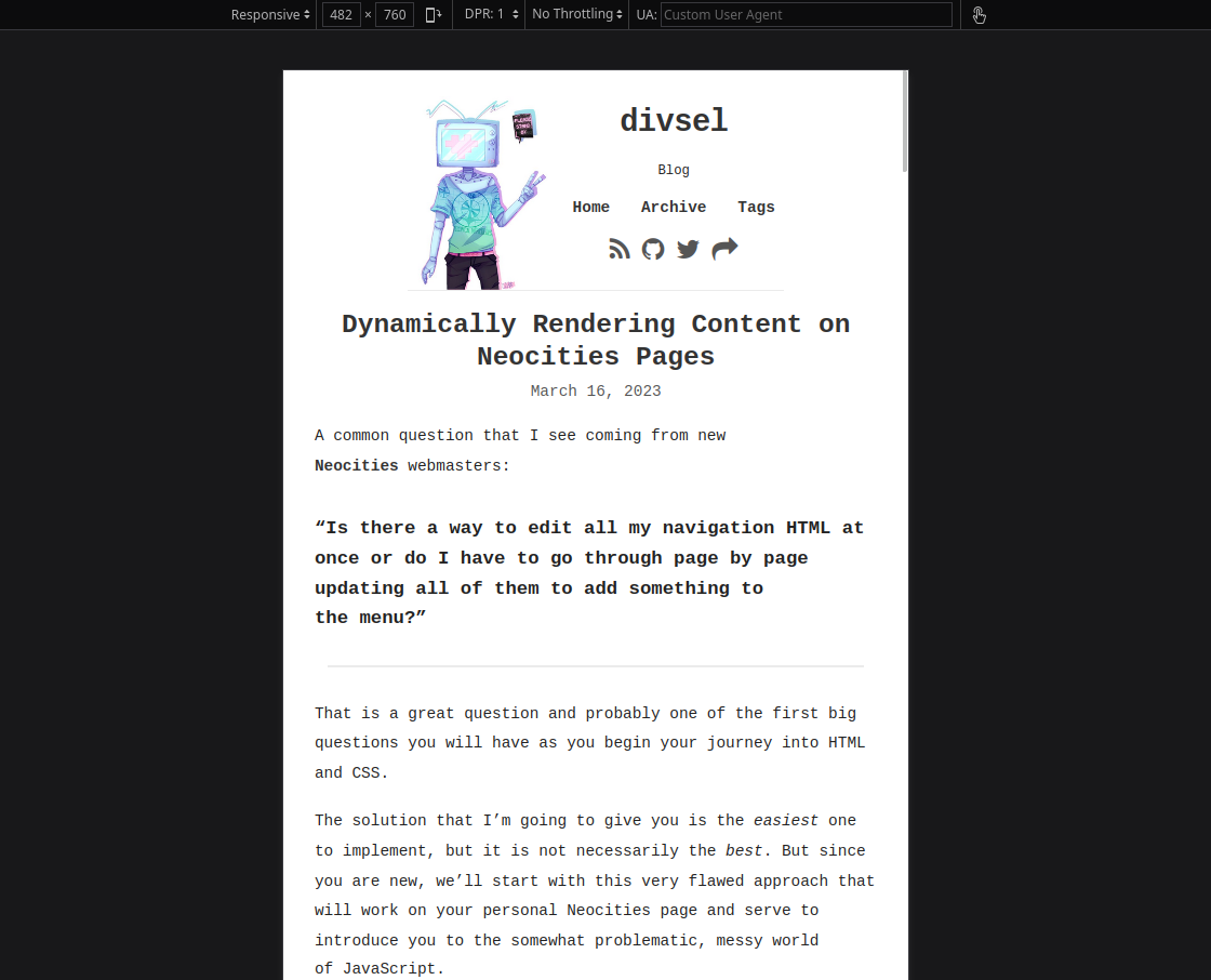
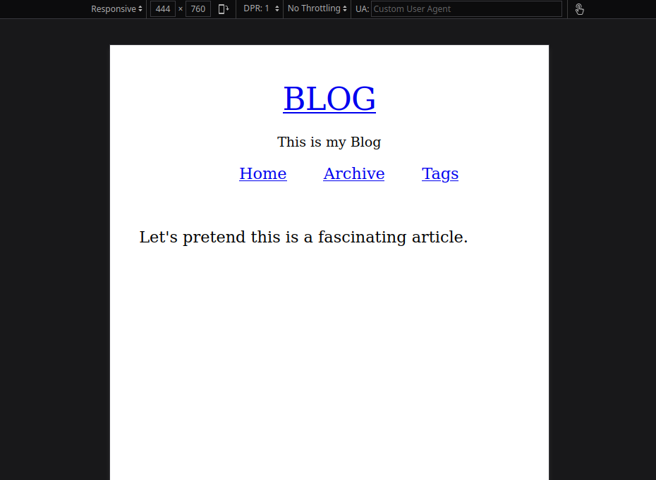
You can observe the sidebar is positioned to the left of the content when the width is above a certain threshold. If you go small enough, the sidebar will snap to the top, making room for the content to fill up the screen.
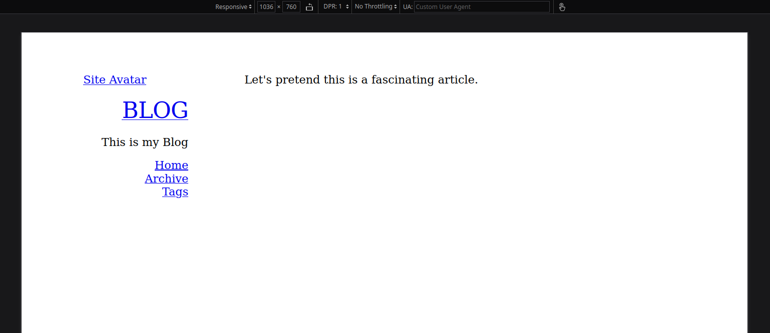
To demonstrate how this is accomplished, I’ve reduced the basic structure of this page to the following template.
Template
If you cut down my site theme into only this HTML and CSS and put it onto a page, you’ll have a template.
HTML
<div class="container">
    <aside>
        <a href="/">
            <img id="avatar" alt="Site Avatar" src="/images/icons/avatar.png">
        </a>
        <div id="name"><a href="/">BLOG</a></div>
        <div id="bio">This is my Blog</div>
        <div id="sidebar-links">
            <ul>
                <li><a href="/">Home</a></li>
                <li><a href="/archive/">Archive</a></li>
                <li><a href="/tags/">Tags</a></li>
            </ul>
        </div>
        <div id="social">
            <a href="#" title="Blah" class="icon fa fa-blah"></a>
            <a href="#" title="BlahBlah" class="icon fa fa-blah-blah"></a>
        </div>
    </aside>

    <article>Let's pretend this is a fascinating article.</article>
</div>
You can see that an aside and an article are siblings wrapped in a container div. The aside is the side/top bar and the article is the content. For the purposes of this demonstration, we’re mainly considering the display context of the aside, so let’s look at the CSS for that.
CSS
/* Set Up Default CSS Properties For All Sizes */
article, aside { display:block; }
ol, ul { list-style:none; }
.container {
    position:relative;
    width:900px;
    margin:0 auto;
    padding-top:50px
}
aside div {
    margin:12px 0;
    text-align:right
}
#avatar {
    margin:0 auto;
    display:block;
    width:140px;
    border-radius:15px
}
#name {
    font-size:2em;
    line-height:1.35;
    letter-spacing:-0.5px
}
#bio {
    line-height:1.5
}
#sidebar-links {
    color:#aaa
}
#sidebar-links ul {
    list-style:none;
    margin:0 0
}

/* Set Up CSS Properties If Width No Less than 960px */
@media only screen and (min-width:960px){
    aside,article{
        margin:0 10px
    }
    aside{
        float:left;
        width:160px;
        position:fixed
    }
    article{
        float:right;
        width:640px
    }
    #avatar{
        display:block
    }
}

/* Set Up CSS Properties If Width Less than 960px */
@media only screen and (max-width:959px){
    .container{
        padding-top:3px;
        width:90%
    }
    aside{
        max-width:300px;
        margin:0 auto;
        padding-top:10px;
        vertical-align:middle
    }
    #avatar{
        float:left;
        width:120px;
        display:block
    }
    #bio{
        font-size:.85em
    }
    #social .icon{
        padding:0 1px
    }
    article{
        margin-top:14px
    }
    #sidebar-links ul{
        display:flex;
        justify-content:space-around
    }
    #bio,#name,#social{
        text-align:center
    }
}

/* Set Up CSS Properties If Width Less than 768px */
@media only screen and (max-width:767px){
    /*  */
}
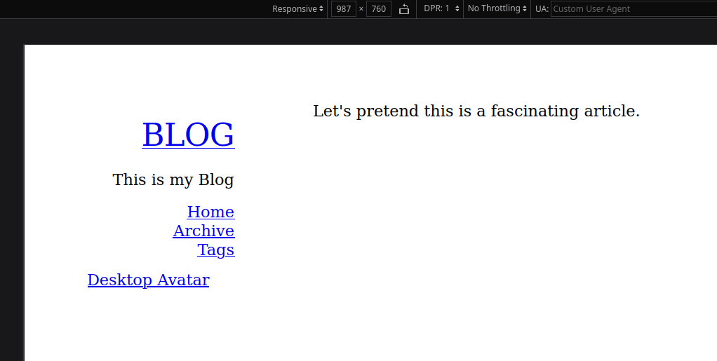
This is What It Looks Like
There are Four Parts to this CSS
CSS For All Sizes
Everything at the top is outside of a media query. This is the normal CSS, where we define how things look no matter what size the screen is. You can think of this as the default starting point before you modify anything based on viewport.
CSS for Desktop Sized Screen
@media only screen and (min-width:960px){
    aside{
        float:left;
        width:160px;
        position:fixed
    }
    article{
        float:right;
        width:640px
    }
}
While we are doing a few other things, the main thing that’s going on at desktop size is we are floating the article right and the aside left. We’re setting the pixel width of each, and we’re setting the position of the aside to fixed. This is what makes it stay on screen even if we scroll up and down.
CSS for Handheld Sized Screen
@media only screen and (max-width:959px){
    .container{
        padding-top:3px;
        width:90%
    }
    aside{
        max-width:300px;
        margin:0 auto;
        padding-top:10px;
        vertical-align:middle
    }
}
Again, we’re doing a few other things, but the main point is that when we go smaller than the desktop-sized screen…
- We modify the width of the container div to be 90% of the screen.
- We set the max-width of the
asideto300px, this is what pushes everything into 300 pixel space instead of taking up the whole screen. - We set the margin of the
asideto0 auto, this is what centers everything.
You might be asking… what are we doing that pushes it to the top? The answer is nothing. The aside is naturally on top of the article because we defined them both as display:block; level elements outside the media queries. The only reason they appear left and right when the screen is bigger is because we told it do that in the media query for (min-width:960px).
But because the screen is smaller than that, those properties don’t apply and instead the ones from (max-width:959px) apply.
CSS for Mobile Sized Screen
@media only screen and (max-width:767px){
    /*  */
}
If we wanted, we could make adjustments going even smaller.
Developing for Multiple Viewports at Once
A consequence of using a responsive template that uses media queries is that from now on, you must open the site in responsive design mode and look at it from every viewport any time you make any change to the site. If you simply add or move something in the HTML and only look at it from the desktop viewport, you’ll be unaware of the unintended side effects that are unaccounted for at the other viewport sizes.
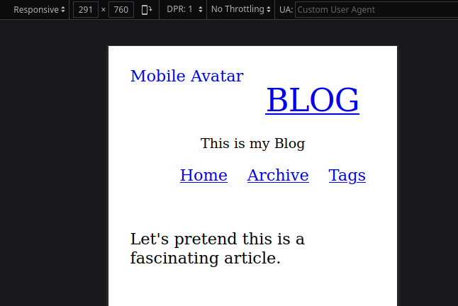
Let’s do something with my site as an example. How about we move the avatar image down so that it’s below our sidebar links?
<div class="container">
    <aside>
        <!-- This is where the avatar used to be -->

        <div id="name"><a href="/">BLOG</a></div>
        <div id="bio">This is my Blog</div>
        <div id="sidebar-links">
            <ul>
                <li><a href="/">Home</a></li>
                <li><a href="/archive/">Archive</a></li>
                <li><a href="/tags/">Tags</a></li>
            </ul>
        </div>

        <!-- Now let's move the avatar down here -->
        <a href="/">
            <img id="avatar" alt="Site Avatar" src="/images/icons/avatar.png">
        </a>

        <div id="social">
            <a href="#" title="Blah" class="icon fa fa-blah"></a>
            <a href="#" title="BlahBlah" class="icon fa fa-blah-blah"></a>
        </div>
    </aside>

    <article>Let's pretend this is a fascinating article.</article>
</div>
Notice that this looks fine at the desktop size, but how does it look at the mobile size?
It takes up too much space and appears below everything. And if we weren’t looking at both when we made this change, we’d never know that.
One way to make this work that might be something of a hack but one which does work: We move the element up and down based on the size of the screen. But moving the element isn’t possible with CSS. What we can do instead to create that illusion is make two of the same element with unique ids and conditionally display them with media queries.
Modified Template
HTML
<div class="container">
    <aside>
        <!-- Notice the id is avatar-mobile -->
        <a href="/">
            <img id="avatar-mobile" alt="Mobile Avatar" src="/images/icons/avatar.png">
        </a>
        <div id="name"><a href="/">BLOG</a></div>
        <div id="bio">This is my Blog</div>
        <div id="sidebar-links">
            <ul>
                <li><a href="/">Home</a></li>
                <li><a href="/archive/">Archive</a></li>
                <li><a href="/tags/">Tags</a></li>
            </ul>
        </div>

        <!-- Notice the id is avatar -->
        <a href="/">
            <img id="avatar" alt="Desktop Avatar" src="/images/icons/avatar.png">
        </a>

        <div id="social">
            <a href="#" title="Blah" class="icon fa fa-blah"></a>
            <a href="#" title="BlahBlah" class="icon fa fa-blah-blah"></a>
        </div>
    </aside>

    <article>Let's pretend this is a fascinating article.</article>
</div>
CSS
/* Set Up Default CSS Properties For All Sizes */
article, aside { display:block; }
ol, ul { list-style:none; }
.container {
    position:relative;
    width:900px;
    margin:0 auto;
    padding-top:50px
}
aside div {
    margin:12px 0;
    text-align:right
}
#avatar {
    margin:0 auto;
    display:block;
    width:140px;
    border-radius:15px
}
#name {
    font-size:2em;
    line-height:1.35;
    letter-spacing:-0.5px
}
#bio {
    line-height:1.5
}
#sidebar-links {
    color:#aaa
}
#sidebar-links ul {
    list-style:none;
    margin:0 0
}

/* Set Up CSS Properties If Width No Less than 960px */
@media only screen and (min-width:960px){
    aside,article{
        margin:0 10px
    }
    aside{
        float:left;
        width:160px;
        position:fixed
    }
    article{
        float:right;
        width:640px
    }
    #avatar{
        display:block
    }
    #avatar-mobile{
        display:none
    }
}

/* Set Up CSS Properties If Width Less than 960px */
@media only screen and (max-width:959px){
    .container{
        padding-top:3px;
        width:90%
    }
    aside{
        max-width:300px;
        margin:0 auto;
        padding-top:10px;
        vertical-align:middle
    }
    #avatar{
        display:none
    }
    #avatar-mobile{
        float:left;
        width:120px;
        display:block
    }
    #bio{
        font-size:.85em
    }
    #social .icon{
        padding:0 1px
    }
    article{
        margin-top:14px
    }
    #sidebar-links ul{
        display:flex;
        justify-content:space-around
    }
    #bio,#name,#social{
        text-align:center
    }
}

/* Set Up CSS Properties If Width Less than 768px */
@media only screen and (max-width:767px){
    #sidebar-divider{
        display:block
    }
}
The takeaway here is that we now have two avatar ids.
Outside of the media query, we define the #avatar selector as
#avatar {
    margin:0 auto;
    display:block;
    width:140px;
    border-radius:15px
}
Then inside the desktop sized media query, we display one and not the other:
@media only screen and (min-width:960px){
    #avatar{
        display:block
    }
    #avatar-mobile{
        display:none
    }
}
Then at the smaller size we do the opposite.
@media only screen and (max-width:959px){
    #avatar{
        display:none
    }
    #avatar-mobile{
        float:left;
        width:120px;
        display:block
    }
}
The element doesn’t really move. We have two elements that are the same thing with unique ids. One id displays at one size and another id displays at another size.
There might have been a simpler way to just float the avatar left conditionally, but I wanted to show that you do have the power to render completely different things at different sizes if you need to.